Lab 2: Creating a Collectible Card
General Description
Over the next two labs, you will build a collectible card (Lab 1) and a
card gallery (Lab
2) to house your collection.
In this first lab, you will practice working with variables and data types, specifically string. Once your data is defined, you will build a card
interface to display your JavaScript
values.
Learning Objectives
- Define and organize information using JavaScript variables and data types.
- Visualize JavaScript data within a card using the Vuetify user interface library.
Table of Contents
- Choose a Theme
- Describe Your Theme with Variables
- Setup Starter Vuetify Code
- Display Your Theme Data in a Card
- Style the Card
- Optional Challenge: Explore More Styling Options and Create Another Card
- Wrap Up & Saving Your Work
Choose a Theme
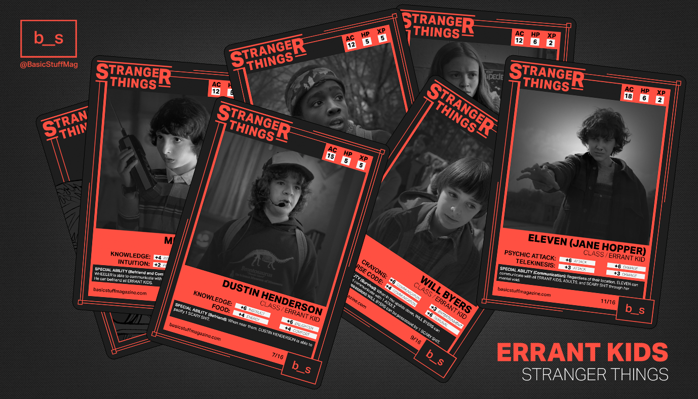
Collectible cards can feature a wide variety of themes, such as video game characters, professional athletes, movie stars, or even categories like rare plants, vintage cameras, or books.
- Brainstorm a theme for your collection. While this lab uses characters from the "Stranger Things" series as an example, you are encouraged to adapt the theme to a subject that interests you.
- Identify 4-6 characteristics that describe your character or category (e.g., name, birthday, release year, a short description, etc).
- Find and download an image online that represents your chosen subject.
Describe Your Theme with Variables
In this step you will save the 4-6 characteristics from the step above into variables.
- Open VS code and create a new file:
File > New Text File. Save the file asapp.js - Think of variable names that could represent the 4-6 characteristics and type them in the file. See example below:
const name = "Robin Buckley";
const birthday = "March 10, 1968";
const birthplace = "Hawkins, Indiana";
const bio = "A clever and multilingual employee at Scoops Ahoy who becomes an essential member of the Hawkins crew after helping decode a secret Russian transmission.";
const image = "robin-buckley.jpg";
Setup Starter Vuetify Code
Vuetify library that allows us to load pre-built components, also known as widgets, to create complex user interfaces. This includes components/widgets such as interactive cards, navigation bars, data tables, buttons, and layout grids. ... click to learn more
In this step, you will configure the boilerplate code, that is, the essential 'starter code' required to connect Vuetify to your JavaScript file.
Setup Vuetify Boilerplate Code in Your JavaScript File
- In your app.js file, place the following starter code at the top, before your variables:
- In this same file, wrap your variables in a
Appstructure so Vuetify can recognize them. This includes returning your variables to make them available/accessible to display in the card that we will create in step 4. Follow the example code below: - Finally, add the following code at the end of the JavaScript file to connect the app logic to an HTML file, which we will create in step 3.2:
const { createApp } = Vue;
const { createVuetify } = Vuetify;
const vuetify = createVuetify();
const App = {
 setup() {

  const name = "Robin Buckley";
  const birthday = "March 10, 1968";
  const birthplace = "Hawkins, Indiana";
  const bio = "A clever and multilingual employee...";
  const image = "images/robin-buckley.jpg";

 return {
   name,
   birthday,
   birthplace,
   bio,
   image
  }
 }
}
createApp(App).use(vuetify).mount('#app');
Setup HTML Boilerplate Code
Before we can see our character card, we need a place for it to live. This is where
HTML
(HyperText Markup Language)
comes in to help us structure our document.
In a Vuetify project, think of HTML as the skeleton of your application. While JavaScript
(your
app.js) handles the data and the logic, the HTML file provides the actual
containers/components/widgets
where
that data will be displayed.
- In VS Code, create a new text file named
index.html. - VS code allow us to generate the HTML starter code automatically by typing
!and pressingEnter(Windows) orReturn(Mac). If you do this, you should see a structure like the one below: - Inside the
<head>section, add the following links to load Vuetify components, styles, and icons: - Finally, add the following line immediately after the libraries in the
<head>. This will connect your JavaScript file (app.js). Please, ensure your file is named exactlyapp.js:
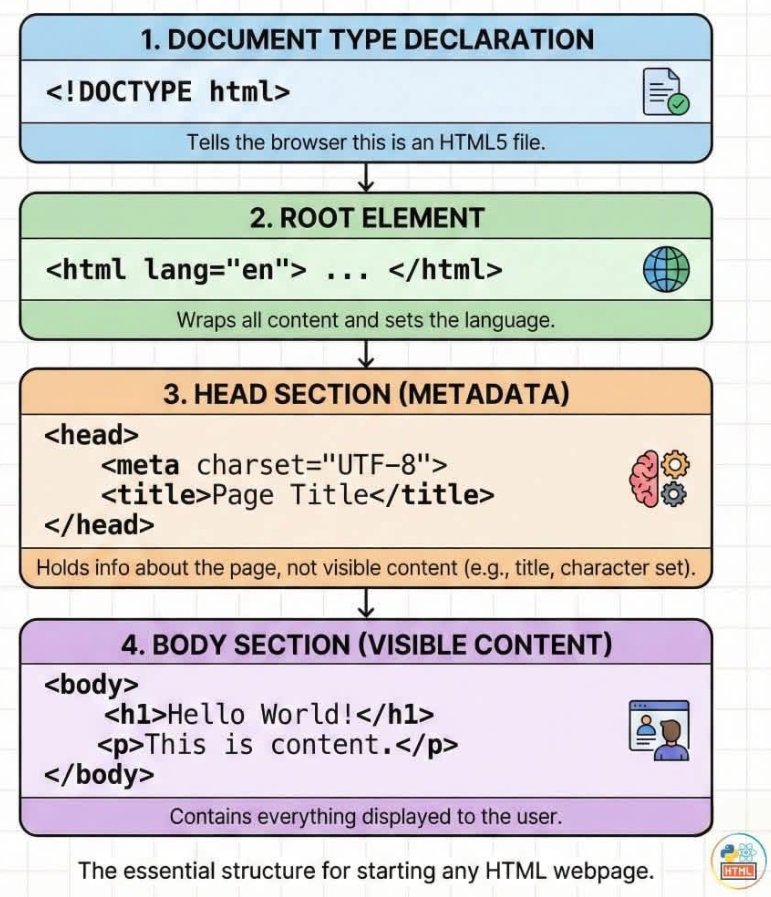
<!DOCTYPE html>
<html lang="en">
<head>
    <meta charset="UTF-8">
    <meta name="viewport" content="width=device-width, initial-scale=1.0">
    <title>Document</title>
</head>
<body>

</body>
</html>
What does this HTML code mean?
This infographic explains how the different lines of code work together!
<link href="https://cdn.jsdelivr.net/npm/vuetify@3.x/dist/vuetify.min.css" rel="stylesheet">
<link href="https://cdn.jsdelivr.net/npm/@mdi/font@7.x/css/materialdesignicons.min.css" rel="stylesheet">
<script src="https://unpkg.com/vue@3/dist/vue.global.js"></script>
<script src="https://cdn.jsdelivr.net/npm/vuetify@3.x/dist/vuetify.min.js"></script>
<script src="app.js" defer></script>
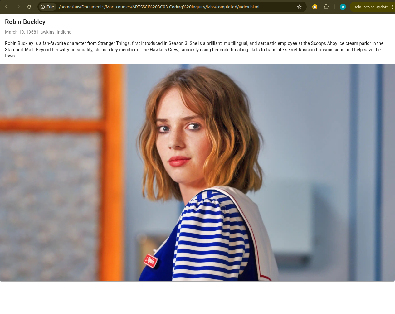
Display Your Theme Data in a Card
It is time to build the actual card! In this step, you will code the actual sections of a card and will display you variables' data/values in these sections. Finally, you will visualize your card in a browser.
- Find the
<body>tag in your index.html file. Inside it, add a<div>with the commandidand the value"app". This is where the app is initialized and is required for every app project. - Inside your
<div>add the<v-app>and<v-main>tags. This is also required for every Vuetify project.- <v-app>: It sets up the base styles (like fonts and colors).
- <v-main>: This tells Vuetify where your content lives.
- Inside
<v-main>, we will add a<v-card>. This is what will display a card! - Inside your <v-card> add the sections:
<v-card-title>,<v-card-subtitle>,<v-card-text>, and<v-img.- To show the data from your app.js file, place your variables names inside double curly braces {{ }}, one at a time. This procedure will replace the name of the variable with its actual value.
- For images, we use a colon (
:) beforesrcto return the variable from the JavaScript file.
- To see your work, save your changes and open a new tab in your browser (Chrome recommended). Then, press
Ctrl + O (Windows) or Cmd + O (Mac) and select your index.html file.
- Alternatively, you can open the folder where you saved your work and simply drag the index.html file directly into your browser window.
  <div id="app">
  </div>
<v-app>
  <v-main>
    </v-main>
</v-app>
<v-app>
  <v-main>
  <v-card>
   </v-card>
    </v-main>
</v-app>
<v-card>
  <v-card-title>
   {{ name }}
  </v-card-title>

  <v-card-subtitle>
    {{birthday}} {{ birthplace }}
  </v-card-subtitle>

  <v-card-text>
    {{ bio }}
  </v-card-text>

  <v-img :src="image"> </v-img>

</v-card>
What is the anatomy of a card?
Go to this link to learn about the different parts of a card:
https://vuetifyjs.com/en/components/cards/#anatomy
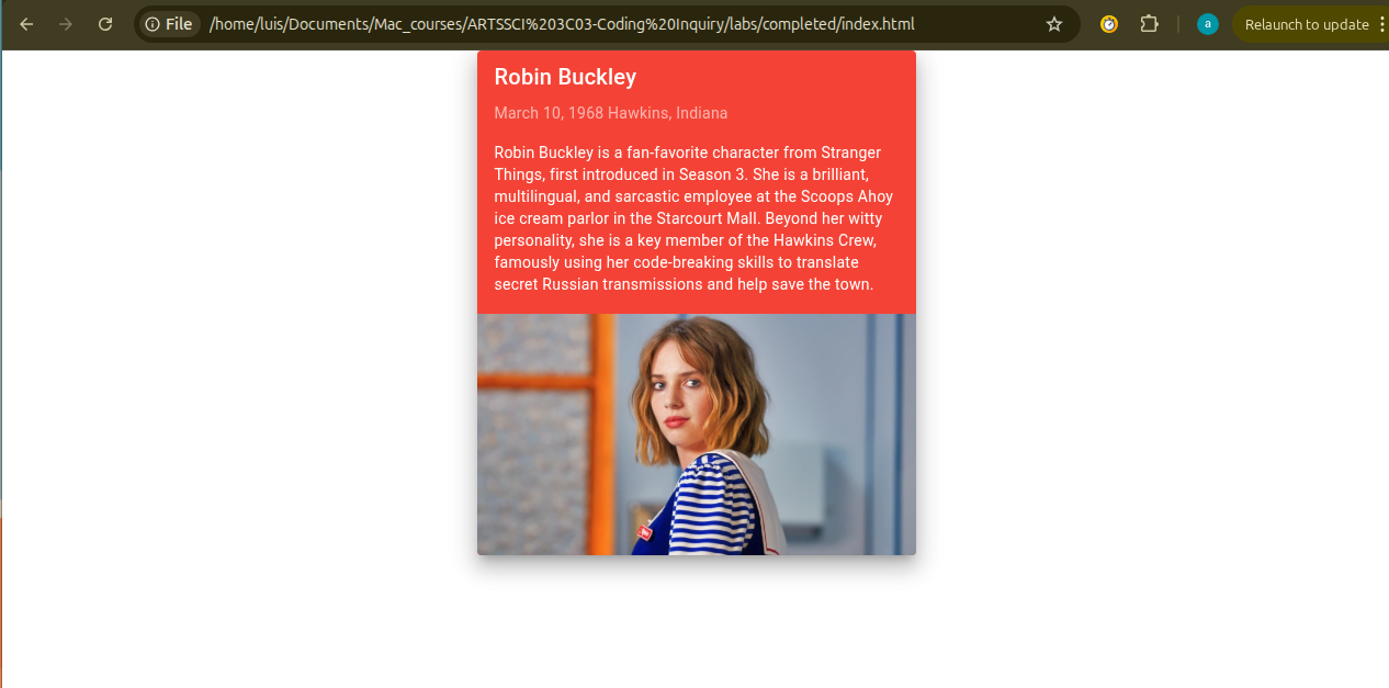
Style the Card
Vuetify provides additional commands that go inside the components to style them. In this step, you will resize and ceter your card, and play with the background color and elevation.
- Sizing the Card: By default, your card is very wide. Use the command
widthand a value such as"400"to limit the card width.- You can try other values to see how the card resizes accordingly. You can also use percentages like
"25%".
<v-card width="400"> - You can try other values to see how the card resizes accordingly. You can also use percentages like
- Centering the Card: By default, your card appears on the left side of the browser. Use the command
classand a value such as"mx-auto", which allows to center elements horizontally (x axis).- Check other spacing values here: https://vuetifyjs.com/en/styles/spacing/#usage.
<v-card width="400" class="mx-auto"> - Changing Background Color: You can change the background color using the same
classcommand. Just add the valuebg-followed by a color name likered.- Explore other colors here: https://vuetifyjs.com/en/styles/colors/#material-colors.
<v-card width="400" class="mx-auto bg-red" > - Adding Elevation: Elevation is a shadow that will make the card pop off the page. In the
classcommand, add the valueelevantion-and a number up to 24.<v-card width="400" class="mx-auto bg-red elevation-12" >
Optional Challenge: Explore More Styling Options and Create Another Card
Try the following activities if you are up for a challenge, otherwise, jump to the final section "Wrap Up & Saving Your Work" below.
Styling Activities
- Explore spacing: Explore Vuetify documentation to learn how to add margins/spacing
https://vuetifyjs.com/en/styles/spacing/#usage - Change the text color: Explore Vuetify documentation to learn how to change the text color
https://vuetifyjs.com/en/styles/colors/#classes - Change the text size: Explore Vuetify documentation to learn how to change the text size
https://vuetifyjs.com/en/styles/text-and-typography/#usage
Create Another Card
Now that you have one card working, try adding a second character or item to your collection! This will test your ability to link new data from JavaScript to your HTML.
- Create new variables in your app.js file (e.g.,
name2,bio2,image2).- You must add these new names to the
return { ... }block at the bottom of yoursetup()function, or the HTML won't be able to "see" them.
- You must add these new names to the
- Back in the index file, find the closing
</v-card>of your first card. - Immediately below that closing tag, create a new card starting with another
<v-card>.<!-- First Card --> <v-card width="400class="mx-auto bg-red elevation-12" > <v-card-title>{{ name }}</v-card-title> <!-- Other sections (title, sub-title, image, etc) --> </v-card> <!-- Second Card Starts Here --> <v-card width="400" class="mx-auto mt-5 bg-blue" > <v-img :src="image2" height="200" cover></v-img> <v-card-title>{{ name2 }}</v-card-title> <v-card-text>{{ bio2 }}</v-card-text> </v-card>
Wrap Up & Saving Your Work
Congratulations! Today, you bridged the gap between raw data (JavaScript) and visual design (Vuetify/HTML) by coding a styled collectible card.
What You Achieved Today:
- Data Storage: You used JavaScript variables to store character information using text (
stringdata type). - App Setup: You connected a JavaScript file to an HTML file using boilerplate/starte code.
- Component Architecture: You used Vuetify tags like
<v-card>and<v-img>to build a professional UI. - Attribute Binding: You used
{{ }}and:srcto dynamically pull data from your JavaScript file.
Save for Next Week:
There is no formal submission today, however, please ensure your project is saved correctly in your computer and ready to use next class.